
Graphic design for social media
Graphic design for social media: The ultimate guide to capturing attention
Graphic design and trends

Many people think that social media marketing is just a matter of good copy and the right hashtags. However, in 2025, if your visual content is not up to the task, your message gets lost in the crowd of others. Bad design is not just an aesthetic problem, it is a business problem. It sends the message that you do not care, that you are unprofessional, or, worse, that you are irrelevant.
But what if you are not a designer? What if terms like "color palette" or "hierarchy" are completely unfamiliar to you?
This guide is written just for you. Whether you are an entrepreneur who wants to run their own profiles, a marketing manager, or are just starting to learn about design, here we will cover the basics. From why design is crucial, through how to make an IG post that attracts likes, to the tools that will make your life easier.
Why is graphic design crucial for success on social media?
Before we explain the "how," let's establish the "why." Ignoring the visual aspect is like opening a restaurant with fantastic food, but in a dirty and dark space.
1. The first impression is formed in milliseconds
On average, a user spends less than two seconds on a single post. In that fraction of time, your design must communicate who you are and why they should care. A professional, clear, and attractive design immediately builds trust and draws attention.
2. Building a recognizable brand
How do people recognize your brand in a sea of content? Through consistency. Your visual identity on social media - logo, brand color palette, specific fonts - creates a mental shortcut in the consumer's mind. When they see your recognizable shade of blue or a specific illustration style, they instantly know it's you. This is called branding on social media and it is the foundation of loyalty.
3. Increasing engagement
People are visual beings. Content with relevant and high-quality images gets significantly more views and engagement (likes, comments, shares) than content without them. Good design not only attracts attention, but also encourages interaction. Infographics, for example, tend to be widely shared because they package useful information in an easy-to-digest format.
4. Efficiently conveying the message
Sometimes a picture truly is worth a thousand words. A complex message or data point can be communicated much faster and more effectively through a well-designed chart, infographic, or even a simple but powerful quote than through a long status update. Design directs attention and makes information easier to understand.
The basic pillars of design for social media
You do not need to be Picasso to create good design. You just need to understand a few basic principles. These are your foundations:
Visual identity
As we mentioned, this is sacred. Before you create even one post, you need to define:
Logo: It must be clear and adaptable for small formats (e.g., profile picture).
Color palette: Do not use 50 shades. Choose 3-5 primary and secondary colors that reflect your brand (e.g., blue for finance, energetic orange for fitness, etc.).
Typography (Fonts): Choose 2-3 fonts - one for headings, one for body text. They must be easy to read on small screens. Forget about unreadable and overly decorative fonts.
Consistent use of these elements in every post creates a cohesive and professional look for your profile.
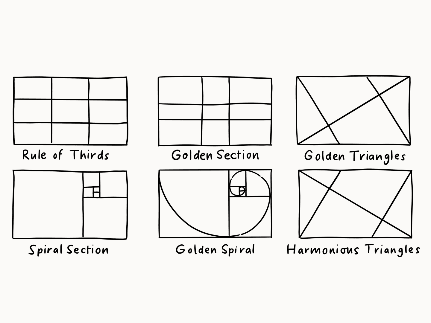
Composition and hierarchy
Where do you want the user to look first? That is hierarchy.
Focal point: Every design must have one main element, and that can be a title, a product image, or a call to action (CTA).
Balance: Do not cram everything into one corner. Arrange elements evenly. Use "negative space" (empty space) so the design can breathe. A cluttered design creates the opposite effect.
Rule of thirds: Imagine your design is divided into 9 equal squares (like a grid). Place the most important elements at the intersections of those lines. This is a simple trick that immediately makes the composition more dynamic.
Readability first
It does not matter how beautiful your design is if no one can read what it says.
Contrast: The text must be clearly visible against the background. Dark text on a light background or vice versa. Avoid combinations like yellow text on a white background.
Font size: Remember, people are viewing this on their phones. The text must be large enough to read without straining.
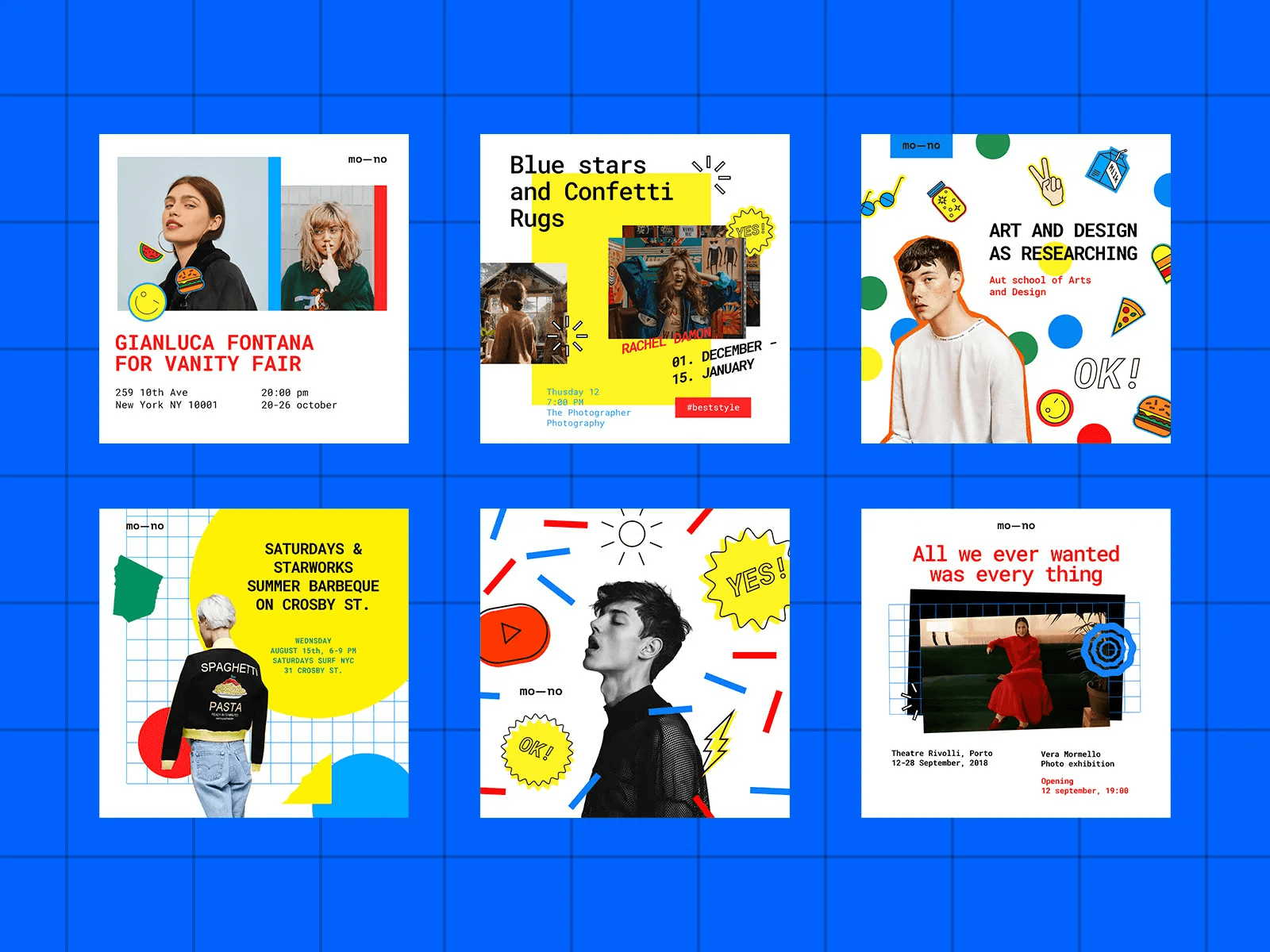
How to design for Instagram: A step-by-step guide
Instagram is the number one visual platform, so the pressure here is highest. Let's go through the process of how to make an IG post that actually gets the job done.
Step 1: Define the goal and format
Before you even open a design tool, ask yourself: What do I want this post to achieve?
Education: Use infographics and tips.
Inspiration: Use quotes and beautiful photos.
Sales: Use product images with clear product features.
Engagement: Ask questions and run polls.
Based on the goal, you choose the format. Will it be a static image (1:1 square or 4:5 portrait), a "carousel" (multiple images in a row), or a video (Reels).
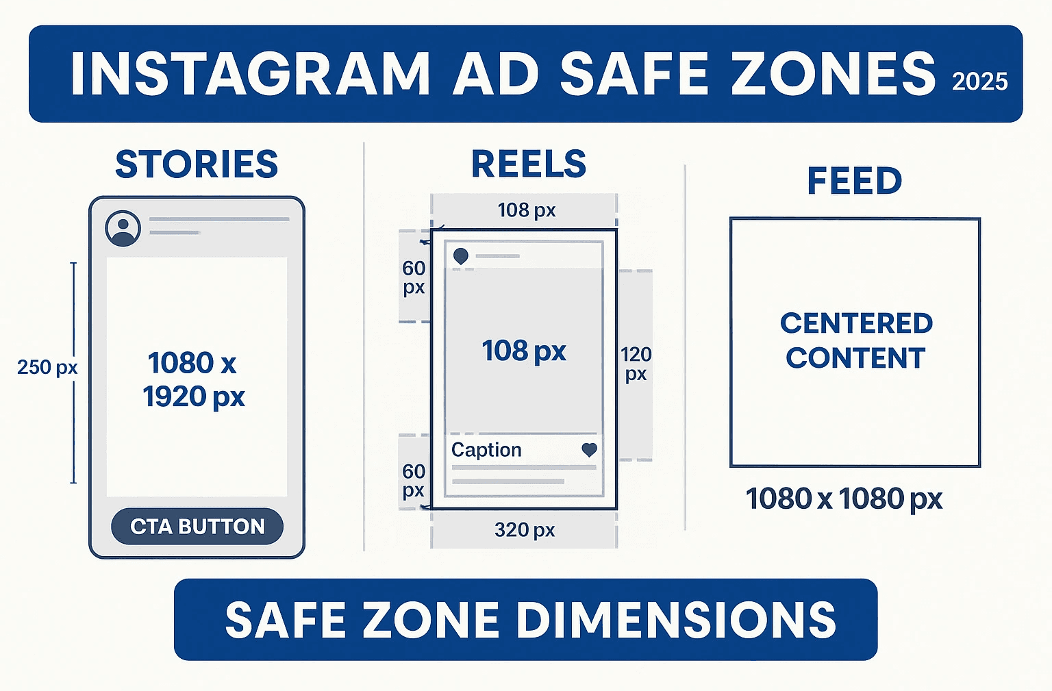
Step 2: Respect the dimensions (This is critical)
There is nothing worse than an image where Instagram cuts off the head or a key part of the text. Using the wrong dimensions looks amateurish.
The most important dimensions for social media (Instagram):
Feed Post (square): 1080 x 1080 pixels
Feed Post (portrait): 1080 x 1350 pixels (This is the recommendation because it takes up more screen space!)
Instagram Story / Reels: 1080 x 1920 pixels
Always design in these dimensions. Most tools, such as Canva for social media, already have ready-made templates with exact measurements.
Step 3: Creating an IG post that stops the scroll
Now the fun begins.
Background: Start with a clean background. It can be a color from your brand palette or a high-quality photo.
Image/Graphic: If you use a photo, make sure it is high resolution, well lit, and clear.
Text (Heading): Add the main title. Make it short, clear, and intriguing. Use 1 font.
Text (Body): If there is additional text, make it readable and concise. People will not read essays on an image.
Call to action (CTA): What do you want them to do? "Swipe for more," "Link in bio," "Save this post." Sometimes this can also be subtle, in the form of an arrow.
Branding: Add your logo or web address discreetly, usually in one of the corners.
Pro tip for "carousel" posts: Use them to tell a story. On the first slide, place a "hook" (e.g., "5 mistakes you make..."), and explain them on the next slides. Let the design "flow" from one slide to the next (e.g., with arrows) to encourage people to keep swiping.
Design for Instagram Stories and Reels
Here the rules get a little different.
Speed: You only have a few seconds. The message must be instantly clear.
Authenticity: Stories can (and should) be less "polished" than feed posts. Use polls, stickers, quizzes.
"Safe Zone": Be careful where you place text! The bottom is reserved for replies, and the top is your name. Keep key information in the center of the screen.
Reels: The "hook" in the first 3 seconds is everything. On-video text is mandatory, because many people watch without sound. Make it readable and fast.
More than Instagram: Design for other popular social networks
It is a mistake to use the same design for all platforms. Each has its own audience and its own rules.
Design for Facebook
Facebook has become a bit more "serious." Design for Facebook must be clear and is often accompanied by more text in the description itself.
Cover Image: This is your digital billboard. Use it to highlight a key message or current offer.
Posts: Images with links are common. The design must be tempting enough to click. The Facebook algorithm once did not like too much text on images (the old 20% rule), but that is now less strict. Still, the visual should dominate.
Design for LinkedIn
The platform for professionals. Your design here builds credibility.
Professionalism: Forget colorful, playful fonts (unless that is part of your brand). Clean lines, calm colors, and data rule here.
Infographics: LinkedIn loves infographics. If you can present statistics or a process visually, you have a winning combination.
Branded quotes and post design tips also perform well, but always in a professional tone.
Tools that make graphic design accessible to everyone
You do not need to be an Adobe Photoshop expert. Today there are tools that have revolutionized creating content for social media.
Canva (Canva for social media): The absolute winner for beginners and professionals who value speed. A huge template library, an easy drag-and-drop interface, access to millions of photos and elements. You can save your "Brand Kit" (colors, fonts, logo) and stay consistent.
Adobe Express (formerly Adobe Spark): Adobe's answer to Canva. Very powerful, with great integration of Adobe Stock photos and fonts.
Figma: Although primarily a UI/UX design tool, many social media managers use it to create templates because it offers incredible control and flexibility.
Professional tools (Photoshop, Illustrator): If you truly want complete control and create complex manipulations or unique illustrations, this is still the industry standard.
The most common mistakes in social media design (and how to avoid them)
Inconsistency: Blue today, red tomorrow. One font today, five different ones tomorrow. This confuses the audience and destroys brand recognition. Solution: Create a mini "brand guide" and stick to it.
Clutter: Trying to fit 10 messages into one post. Solution: One post = one main message. Use white space.
Bad font choices: Using too many fonts (stick to 2 to max 3) or ones that are hard to read. Solution: Choose clarity over style.
Ignoring the "Safe Zone": Text that gets cut off in Instagram Story. Solution: Always check how the design looks on a phone before posting.
Pixelated images: Using low-resolution images. This screams "amateurism." Solution: Always use high-quality photos and export the design in high resolution (e.g., PNG).
Graphic design for social media is not just "making things prettier." It is a key component of your digital marketing. It is a tool for communication, building trust, and, ultimately, driving action.
You do not have to become a designer overnight. Start with the basics: define your visual identity, choose a tool that suits you (like Canva), and focus on clarity and consistency.
Your effort to create high-quality visual content directly communicates respect for your audience. And in the world of social media marketing, the audience returns that respect many times over - through likes, shares, and loyalty.