
10 Mistakes in Website Design
10 design mistakes that are causing your website to lose customers (and you may not even be aware of it)
Conversions, sales, and business

In the world of digital marketing, web design is not art but commercial psychology. Every element on your page either helps the user reach their goal (and helps you make a sale) or stands in their way. That "standing in the way" is called friction.
Many of these mistakes kill conversions. You don't see them in standard reports, but they reduce your return on investment (ROI). As a combined team of UX designers, conversion rate optimization (CRO) experts, and SEO specialists, we don't look at sites only by their beauty. We analyze them by performance.
Let's go through the 10 most common website design mistakes that are costing you customers, probably without you even realizing it.
Why beautiful design is not the same as profitable design
Before we begin, let's break one myth. A "beautiful" site can win design awards, but still have a disastrous conversion rate. On the other hand, some "ugly" sites (like the old Amazon or Craigslist) make billions.
Why? Because user experience (UX) beats mere aesthetics.
Your goal is not to impress other designers. Your goal is to give the user what they are looking for, in the fastest and easiest way possible. Every mistake we'll list is a form of friction, that is, an obstacle that annoys, confuses, or slows the user down.
And in 2025, a frustrated user doesn't look for a solution. They look for another site.
10 design mistakes that are costing you conversions (and how to fix them)
1. Unclear or hidden calls to action (CTA)
Problem: Your call to action (Call to Action) is the most important button on the page. Yet on many sites, it is barely visible. It blends into the background, uses the same color as other, less important elements, or has confusing text like "Next" or "Learn".
Consequence: The user doesn't know what's expected of them. If they have to look for the "Add to cart" or "Sign up" button, you've already lost part of the sale. This directly kills conversions.
Solution:
Contrast: The CTA button must stand out. Use a color that contrasts with the rest of the page, but still fits the brand palette.
Clear text: Instead of passive "Learn more," use action-oriented text that describes the result: "Download the free guide," "Start the trial," "Buy now."
Size and position: The button must be large enough to click easily (especially on mobile) and placed logically, where the user expects to see it after reading the offer.
Micro-example (E-commerce): On a product page, the "Add to cart" button must be the most dominant element. It should not compete with the "Add to wishlist" or "Compare product" button.
Read which most common mistakes destroy landing page conversions.
2. Overcomplicated and long forms
Problem: You land on a page to sign up for a newsletter and the site asks for your first name, last name, email, city, phone number, and the industry you work in.
Consequence: Form abandonment. Every additional field you ask for is a potential reason for the user to give up. People value their time and privacy.
Solution:
Ask for the minimum: For a newsletter, you only need email. For a contact form, name, email, and message.
Multi-step: If you really must ask for more information (for example, in the checkout process), break the form into logical steps. Psychologically, it is easier to fill out 3 steps with 3 fields each than one step with 9 fields.
Clear error handling: If the user makes a mistake, show them exactly where the error is and how to fix it, without deleting the other data they entered.
Micro-example (SaaS): Don't ask for a credit card number for a "free trial." That's the biggest friction there is. Ask only for email and password so the user can get into the product as quickly as possible.
3. Ignoring page speed
Problem: Your site is slow. Maybe it has huge, unoptimized images, too many scripts, or poor hosting. It may seem fast to you because you visit it often (it is cached), but for a new user it takes 5-7 seconds to load.
Consequence: Users leave before the page even loads. Google sees this and penalizes you in rankings (SEO). Research shows that every additional second of loading dramatically increases the bounce rate.
Solution:
Image optimization: Compress images and use modern formats (such as WebP).
Good hosting: Cheap hosting is often slow hosting.
Code minification: Reduce the size of CSS and JavaScript files.
Use tools like Google PageSpeed Insights to identify issues.

4. Terrible mobile user experience
Problem: You open the site on a phone and have to pinch-and-zoom to read the text. The buttons are so small and crowded that you keep pressing the wrong one.
Consequence: Immediate site abandonment. More than 60% (and often much more) of total traffic comes from mobile devices. If your site is not perfectly optimized for mobile, you are knowingly giving up most of your market. Google also primarily ranks sites based on their mobile version (Mobile-First Indexing).
Solution:
Responsive design is not optional; it is mandatory.
Design using the "Mobile-First" principle. Think first about how the site will look and function on a small screen, and only then on desktop.
Check that all elements (buttons, links) are large enough and spaced far enough apart to be easily tapped with a finger.
Find out why mobile optimization is the key to customer retention.
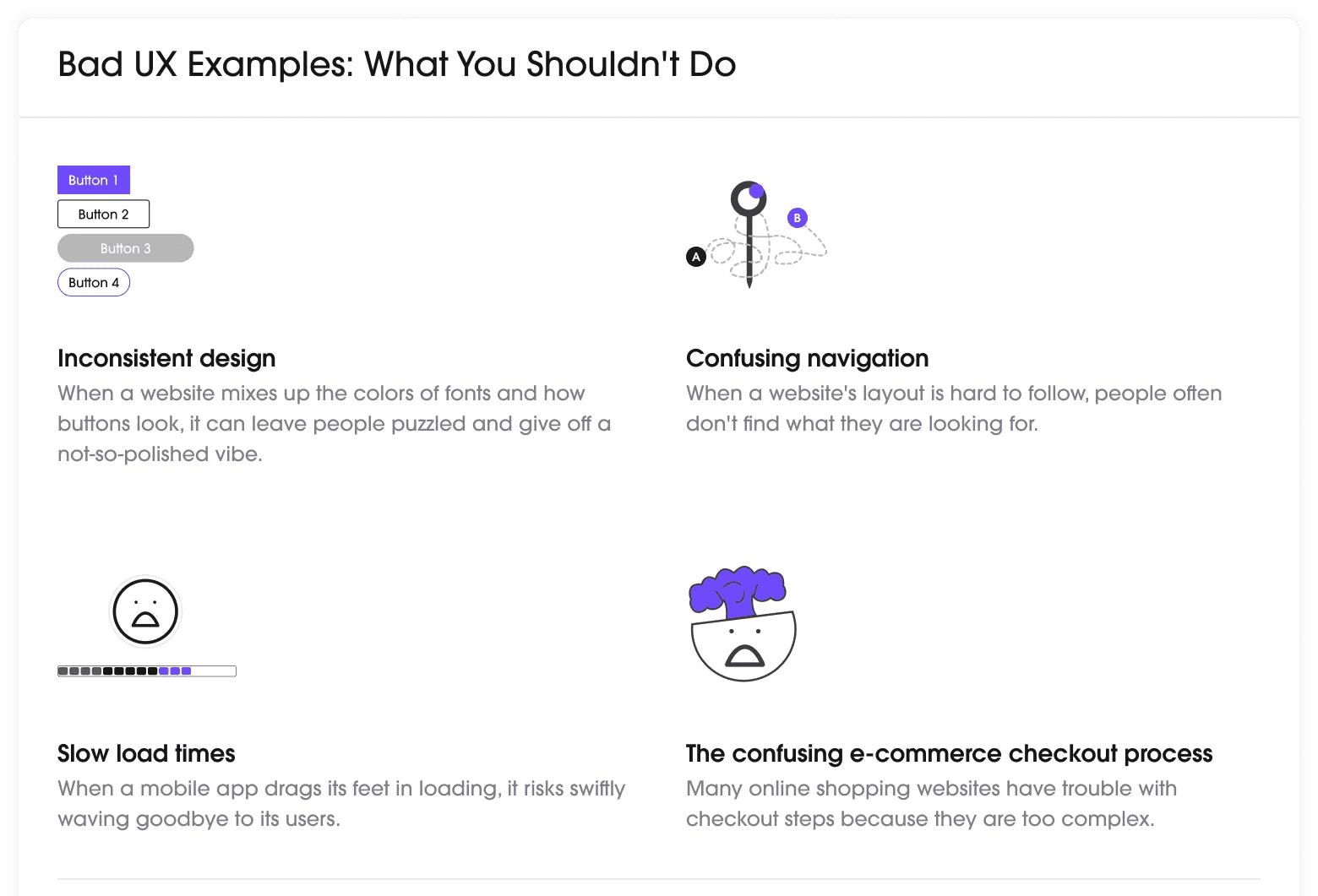
5. Confusing navigation and poor site architecture
Problem: The user wants to find the "Pricing" page. They look at the main menu and see options: "Solutions," "Platform," "Our Story," "Resources," "Partners." Pricing is hidden under "Resources" -> "FAQ."
Consequence: Frustration. The user feels lost and stupid. Nobody likes feeling stupid. They will not play a "treasure hunt" just to give you money. They will go to Google and find a competitor whose pricing is clear.
Solution:
User logic, not yours: Organize the menu the way your user thinks, not the way your company is internally structured.
Stick to standards: Don't reinvent the wheel. "Contact," "Services," "About us," "Prices" are there for a reason.
"Breadcrumbs": On larger sites (especially e-commerce), use breadcrumbs (e.g. Home > Men > Shoes > Sneakers) so the user always knows where they are.
6. Weak "Hero" section (the first screen the user sees)
Problem: The user lands on your homepage (or landing page) and within the first 3 seconds cannot answer the question: "What does this company do and what's in it for me?" Instead, they see a generic image of people shaking hands and a headline that says "Welcome to the future of business."
Consequence: The user does not understand your value proposition and leaves immediately. The first screen (what is visible without scrolling, "above the fold") is your most valuable real estate.
Solution:
Crystal-clear headline: In one sentence, explain what you offer and for whom.
Subheadline: Expand on the headline with the key benefit.
Visuals that support the story: Show the product in action or an image that evokes an emotion tied to the solution, not a generic stock photo.
Primary CTA: A clear call to action must be visible immediately.
Micro-example (Portfolio): Instead of a heading "Welcome to my site," a UX designer's portfolio should say: "I help SaaS companies reduce churn through smart UX design."
7. Poor readability and inaccessible typography
Problem: The text on your site is tiny (for example, 12px), line spacing is too tight, and contrast is poor (for example, light gray letters on a white background). The result is a wall of text that is physically tiring to read.
Consequence: People don't read. If they can't read your product or service description, they definitely won't buy it. You also harm users with visual impairments (accessibility) and SEO (users who leave because they can't read are a bad signal).
Solution:
Font size: For body text (paragraphs), 16px minimum has become the standard.
Contrast: Use contrast-checking tools (WCAG) to make sure the text is readable.
Whitespace: Let the text "breathe." Sufficient spacing between lines and paragraphs dramatically improves readability.
Short paragraphs: Break up long blocks of text. Use subheadings, lists (like this one), and bold text to highlight key points.
8. Hiding key information (Prices, Shipping, Contact)
Problem: The user has found the product they want. They add it to the cart. They go through two checkout steps, enter all their details, and only on the final step, before clicking "Pay," do they learn that shipping costs 800 dinars.
Consequence: Cart abandonment. This is the number one reason people give up on purchases. They feel cheated. The same applies to hiding prices (B2B sites that insist on "Request a quote" for everything) or hiding a contact phone number.
Solution:
Be transparent: Clearly display shipping costs on the product page or offer a calculator.
Contact: Make your contact phone number and email easily accessible (usually in the header or footer). This builds trust.
If pricing is complex, at least provide a "Starting from..." price range instead of hiding it completely.
9. Aggressive and poorly timed pop-up windows
Problem: Just as you arrive on the site, before you even manage to read the headline, a full-screen pop-up appears asking you to sign up for the newsletter.
Consequence: You interrupt the user's intent. It's like walking into a store and the salesperson immediately jumping on your back asking for your phone number. Most people will instinctively close the window, and often the whole site too.
Solution:
Smart triggers: Don't show the pop-up immediately.
"Exit-Intent": Show the pop-up when the mouse sensor detects that the user is about to leave the page. This is your "last chance" and is much less intrusive.
"Scroll-Trigger": Show it after the user has scrolled 70% of the page (which means they are interested in the content).
Always offer a clear and easy close option (X).
10. Visual inconsistency and "chaos"
Problem: On the homepage, the buttons are blue and rounded. On the services page, they are green and square. You use five different fonts, and the spacing between elements is random.
Consequence: The site looks unprofessional, amateurish, and unreliable. If you can't organize your own site, how will the user trust you to solve a serious problem for them (or safely deliver a product)? Inconsistency also confuses the user because they have to keep learning how the site works on every new page.
Solution:
Style Guide or Brand Book: Define clear rules before design begins. What are your primary fonts? What is the color palette? What are the buttons like (primary, secondary)?
Consistency: Follow those rules on every page. This builds brand recognition and inspires trust.
Your site is not an art gallery, but a sales machine
Your website design is never "finished." It is a living organism that must adapt to user behavior.
Stop viewing design as something subjective ("I like this"). Start seeing it as a measurable tool for achieving goals. Each of these 10 mistakes is not an aesthetic, but a financial problem.
Go through your site today, but not as its owner, rather as a tired, impatient buyer who has five competitor tabs open. Be brutally honest. Every "friction" you find is money leaking out of your pocket. Optimizing a website for sales begins the moment you stop admiring the design and start measuring it.
Does your site work for you or against you?
You may be losing customers right now and not even know it. Don't guess. Request a professional UX and CRO analysis and discover the exact design "holes" that are costing you conversions.
Schedule a free 30-minute site analysis