
Why your mobile site frustrates users and how to fix it today
Why your mobile site frustrates users and how to fix it today
Conversions, sales, and business

Today, everyone has a website that “works on a phone.” That’s a standard we achieved more than ten years ago. If you open your site on a smartphone and see that the content has shrunk and stacked one below the other, congratulations — you have responsive design. But here’s an uncomfortable truth: just because your site “works” doesn’t mean people love it.
There is a huge difference between a site that adapts to the screen and a site made for the human hand.
The number of visits from mobile devices is growing, making up 70% or 80% of total traffic, but the conversion rate is still half of what it is on desktop. Why? Because phone users are not just “visitors on a smaller screen.” They are people on the move, with limited patience, using only one finger to get things done.
If you want to stop losing money on mobile traffic, you need to stop thinking in pixels and start thinking in thumbs.
The problem: Responsive design is only half the battle
Most business owners think the job is done the moment a developer says, “The site is mobile-optimized.” The problem is that this optimization is often only visual. Elements don’t overlap, text is readable, images are there. Still, the user feels like they’re trying to operate tweezers while wearing boxing gloves.
The biggest enemy of mobile conversion is friction.
Friction is every second a user spends thinking about where to click. Every time they miss a button because it’s too small. Every time they have to use their other hand to reach a menu in the top-left corner. In a world where attention is the most expensive currency, every bit of friction leads to site abandonment.
Why is mobile conversion lower?
When we sit at a computer, we are in “work mode.” We have a mouse that is precise to a single pixel. We have a large screen and a stable internet connection. On a phone, we are in “transit mode.” We may be waiting in line, riding public transport, or sitting in front of the TV.
Our fingers are thick, the screen is small, and our attention is divided. If your site requires effort from users, they will simply go to a competitor that made life easier for them.
The hidden cost of poor UX
Imagine you are in a store. You want to buy shoes. The salesperson tells you the shoes are on the second floor, but the stairs are so narrow you have to climb sideways. When you get there, the cash register is locked in a small box on the ceiling that you can barely reach.
Would you buy those shoes? Probably not.
That is what you are doing to your users when you offer them a classic responsive site without thinking about ergonomics.
The psychology of frustration
When a user clicks an ad and lands on your site, they have a certain amount of mental energy. Every problem they encounter drains that energy.
A button too close to another link? -10% energy.
A pop-up that can’t be closed because the “X” is too small? -30% energy.
Mandatory registration with 12 fields? The user leaves.
The result is not just a missed sale today. The result is a damaged brand. The user subconsciously associates your brand with a feeling of frustration. The next time they see your ad on Google, their subconscious will tell them: “Run, it’s hard to buy anything there.”
The solution: “Thumb Zone” as the foundation of success
To solve this problem, we need to return to the basics of biology. How do people hold a phone?
Research shows that over 75% of people use their thumb to interact with the screen. More importantly, most people hold the phone with one hand. That means the thumb’s range of motion is limited to an arc that extends from the bottom of the screen toward the center.
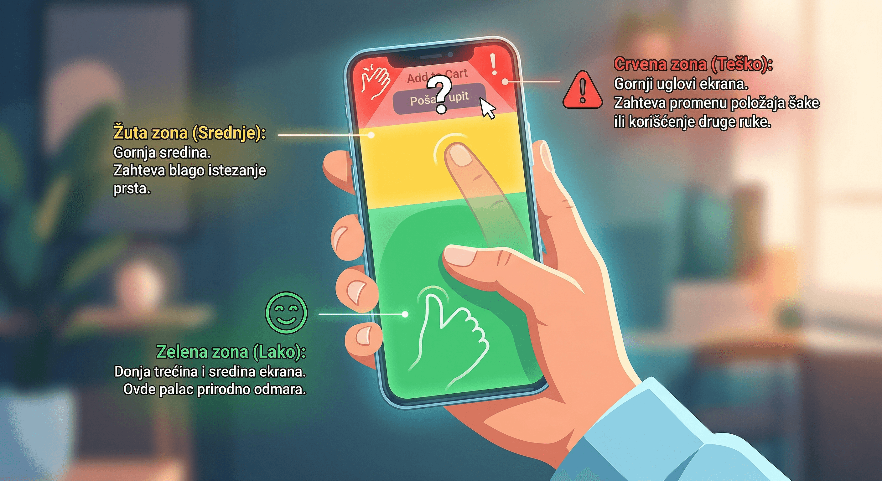
What is the “Thumb Zone”?
Imagine a phone screen.
Green zone (Easy): The bottom third and middle of the screen. This is where the thumb naturally rests.
Yellow zone (Medium): The upper middle. It requires slight finger stretching.
Red zone (Hard): The upper corners of the screen. It requires changing hand position or using the other hand.
If your main button (Add to Cart, Send Inquiry, Sign Up) is in the red zone, you are directly working against your customers’ anatomy.
How to fix the “Thumb Zone” immediately?
Bottom navigation: Forget the “hamburger menu” (those three lines) in the top-left corner. That is the hardest place to reach on the screen. Move your main categories or menu to the bottom of the screen, just like Instagram or Facebook do.
“Sticky” CTA buttons: The purchase or contact button should be fixed at the bottom of the screen while the user scrolls. That keeps it always “under the thumb.”
Size matters: Apple and Google recommend interactive elements be at least 44x44 or 48x48 pixels. Anything smaller leads to “fat finger” syndrome, where users accidentally tap the wrong thing.
From responsive to frictionless design: Key steps
To create a site that truly converts, follow these steps.
1. Speed optimization: Every millisecond counts
On mobile networks (4G, 5G), loading speed is critical. People on phones don’t have time. If a site takes longer than 3 seconds to load, 53% of visitors will give up.
Compress images: Don’t use 2MB images. Use WebP format.
Remove unnecessary scripts: Every plugin that does nothing specific slows down page rendering.
Lazy loading: Load images only when the user reaches them while scrolling.
2. Forms
Filling out forms on a phone is hell. Reduce the number of fields to the absolute minimum.
Autofill: Enable Google or Apple Pay for payments so users don’t have to type card numbers while balancing on a bus.
The right keyboard type: If a field asks for a phone number, open the numeric keyboard automatically, not the text keyboard. It’s a small detail that drastically reduces friction.
Single-column forms: Never place two fields side by side on mobile. Always one below the other.
3. Visual hierarchy and scanning
People on mobile don’t read. They scan.
Short paragraphs: Maximum 2–3 sentences.
Benefit-driven headings: Instead of “About our product,” write “Save 2 hours a day.”
High-contrast colors: Your main button must “scream” compared to the rest of the page. If the site is blue, make the button orange or green.
4. Gestures instead of clicking
Smartphones are made for swiping, not just clicking.
Touch-enabled sliders: If you have an image gallery, let users swipe through it with their finger.
“Pull to refresh”: Implement logic users already know from apps.
Case study: What happens when you move one button?
A large e-commerce clothing store noticed that mobile users added products to cart, but rarely completed purchases. By analyzing heatmaps, they saw that users tried to click “Checkout,” but often missed and clicked “Privacy Policy,” which was right next to it.
What did they do?
They enlarged the checkout button.
They set it as a “sticky” element at the bottom of the screen.
They removed all other links from view during checkout.
Result: A 22% increase in conversion within a month, without changing prices or spending more money on ads.
Why is this important for your profit?
You may think: “Well, my customers are used to it, they’ll figure it out.” That is a dangerous assumption. Your customers are not “figuring it out.” They are enduring it. And as soon as someone appears who lets them do the same thing with three fewer clicks, they will go there.
A seamless mobile experience is not a luxury. It is basic hygiene in modern business.
Lower acquisition cost (CAC): When your site converts better, every dinar you spend on Facebook or Google ads pays off more.
Higher loyalty: People return where it was easy to get things done.
Better SEO: Google uses “mobile-first indexing.” If your UX is poor and people leave your site quickly (high bounce rate), Google will penalize you with a lower search ranking.
How to test your site right now (without a developer)?
Take your phone in the hand you normally use. Try to do the following using only the thumb of that hand:
Add a product to cart from the homepage.
Open the contact page.
Close any pop-up that appears.
Find the site search.
If at any point you had to use your other hand or unnaturally stretch your thumb to the top of the screen — your site is frustrating your users.
Action plan for today:
Move the most important actions into the “bottom zone.”
Increase text size to a minimum of 16px (no one wants to zoom in to read).
Test site speed on Google PageSpeed Insights.
Remove unnecessary fields from the contact form.
A mobile phone is not just a smaller screen. It is a completely different way of interacting with the world. If you respect your user’s thumb, they will reward you with their trust and money.
Want to check how much money you’re losing on mobile conversions? Contact us for a free UX audit of your mobile site. We’ll fix your thumb zone before your competition finds out what it is.