
What is visual identity
What is visual identity and why is it more important than a logo
Branding and identity
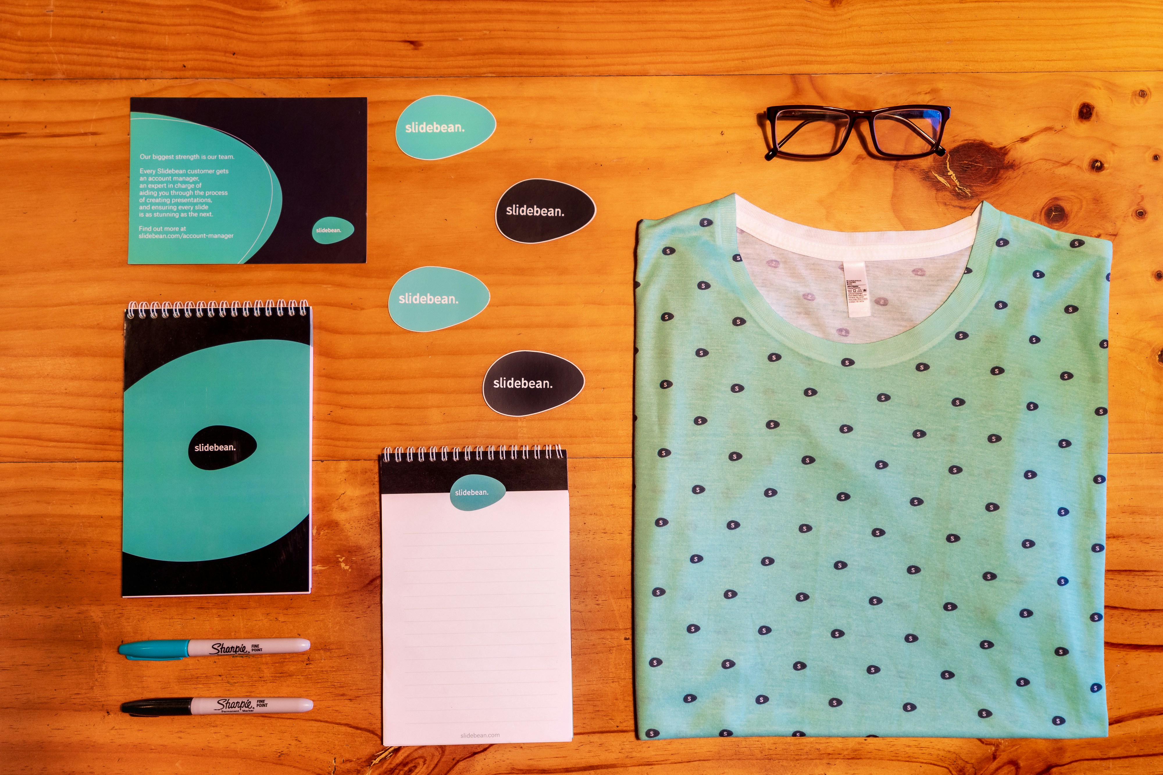
Visual Identity = Logo. Not really. A logo is the front door, but visual identity is the whole house.
I have been doing this job long enough to recognize a pattern. A company orders a logo, gets the file, puts it on their website and Instagram, and thinks the job is done. Then, after a few months, they notice that everything looks different. The photos on Instagram don't have the same style, the colors on the website don't match the colors in the presentation, and the fonts are different everywhere. The result is a brand that doesn't look like a single entity, but like a bunch of randomly connected pieces.
This happens when a logo is confused with visual identity. Let's clarify the difference and go through all the parts that make up a real system.
What exactly makes up a visual identity
Visual identity is a set of rules and elements that determine how your brand looks in every situation, from a business card to a billboard. Here are the basic parts.
Logo and its variations. There is never just one logo. There is a main version, a version for dark backgrounds, a version without text (icon only), and a square format version for social media. If a company only has one logo file, that is the first sign that the visual identity has not been fully developed.
Color palette. You don't choose a color just because it's pretty, but because it carries a specific message and sets you apart from the competition. A palette usually has a primary color, one or two secondary colors, and a couple of neutral tones for text and backgrounds.
Typography. The font for headings and the font for body text are not random choices. They are selected to reflect the brand character—serious, playful, modern, traditional—and to work well on both websites and printed materials.
Icons and graphic elements. Small things that recur throughout all materials, such as shapes, lines, and textures, which make you recognize a brand even without a logo.
Photography and visual style. Whether photos are warm or cool, shot in a studio or on location, and whether you use illustrations or just photos. This is the part companies neglect most often, and an Instagram feed without a consistent style is a direct consequence.
Application guidelines. Everything listed above is brought together in a document, a visual identity manual, which explains exactly how each element is used. How much space is needed around the logo, which color combinations are allowed, and how headings are written on Instagram posts.
Why a logo is not enough
A logo is a symbol. Visual identity is a language. You can have a great logo and still look unprofessional if everything else around it is not aligned.
Imagine someone opening your website, then your Instagram, and then receiving your proposal in a PDF. If all of that looks like it was made by three different people who didn't talk to each other, the client subconsciously registers this as insecurity. They don't need to know the term "visual identity" to feel that something is off.
On the other hand, when everything is aligned—colors, fonts, photo tones—the client gets the feeling that the company is serious and knows what it is doing, even before reading a single word of text.
What happens when a company lacks a clear visual identity
Based on experience, here are the most common consequences.
The first is that every new material feels like starting from scratch. Every time you need a new presentation or post, you come up with colors and fonts on the fly instead of having an established system. This wastes time and money.
The second is a lack of recognition. If someone saw your post today without a logo, would they know it was yours? If the answer is no, it means the visual identity is not strong enough to carry recognition on its own.
The third is an impression of unprofessionalism among larger clients. Companies working with more serious clients, B2B, corporations, or investors, quickly notice when a brand looks amateurish. This directly affects whether they will take you seriously in negotiations.
What the visual identity design process looks like
The process usually begins with research: who your clients are, who the competition is, and what the brand needs to communicate. From this, a strategy, tone, and brand character are extracted before any visual work even begins.
Then comes the design of the logo with its variations, followed by the color palette and typography, graphic elements, and photography guidelines. Finally, everything is compiled into a brand book, a document that anyone working on company materials can use as a guide.
This is not a one-day process. A serious visual identity usually takes several weeks, as each part depends on the previous one.
Do you really need a full visual identity
If you have just started and your budget is limited, you don't have to create a complete fifty-page brand book right away. But the minimum you need is a logo with two to three variations, a palette of three to five colors, and two fonts. This is enough to keep you looking consistent as you grow.
As the company grows and adds channels, social media, printed materials, and a larger content-creation team, it then makes sense to expand the system and establish full application guidelines.
You don't have to come up with colors, fonts, and application guidelines by yourself. I work with small businesses and entrepreneurs on complete visual identities, from logos to brand books, so that your brand looks consistent everywhere it appears.
Send an inquiry and let's review together what your brand is currently missing.
Are a logo and a visual identity the same thing?
How much does it cost to create a visual identity?
Do I need a visual identity if I am just starting a business?
How long does it take to create a visual identity?
What is a brand book and do I need one?

Senior UX/UI i produkt dizajner iz Beograda, sa više od 10 godina iskustva. Sarađivao je sa klijentima kao što su MerchKing, Bex kurirska služba, Balkan grupacija, Maeti, 502 Solutions, DataWiz i mnogi drugi. Ima Google i Adobe specijalizacije i Uxcel sertifikat za UX/UI dizajn.