
The psychology of color in graphic design
The power of colors and how color psychology shapes the perception of your brand
Graphic design and trends

Imagine walking into a luxury watch store, and the walls are bright neon pink, while the shelves are grass green. Even if the watches are top-tier, your subconscious would scream that something is off. You would probably leave before looking at a single price. Why? Because the colors sent a message that clashed with what the brand is trying to sell.
In a world where the average user spends only a few seconds on your website before judging you, color is not just an aesthetic choice. It is silent communication. According to research, over 90% of first impressions of a product are based solely on color. As a designer, I often see clients choosing colors based on their current mood or what they "like", forgetting that design is not for them, but for their audience.
In this guide, we will go through all layers of color psychology, from basic biology to complex cultural meanings, and explain how to use that information to grow your business.
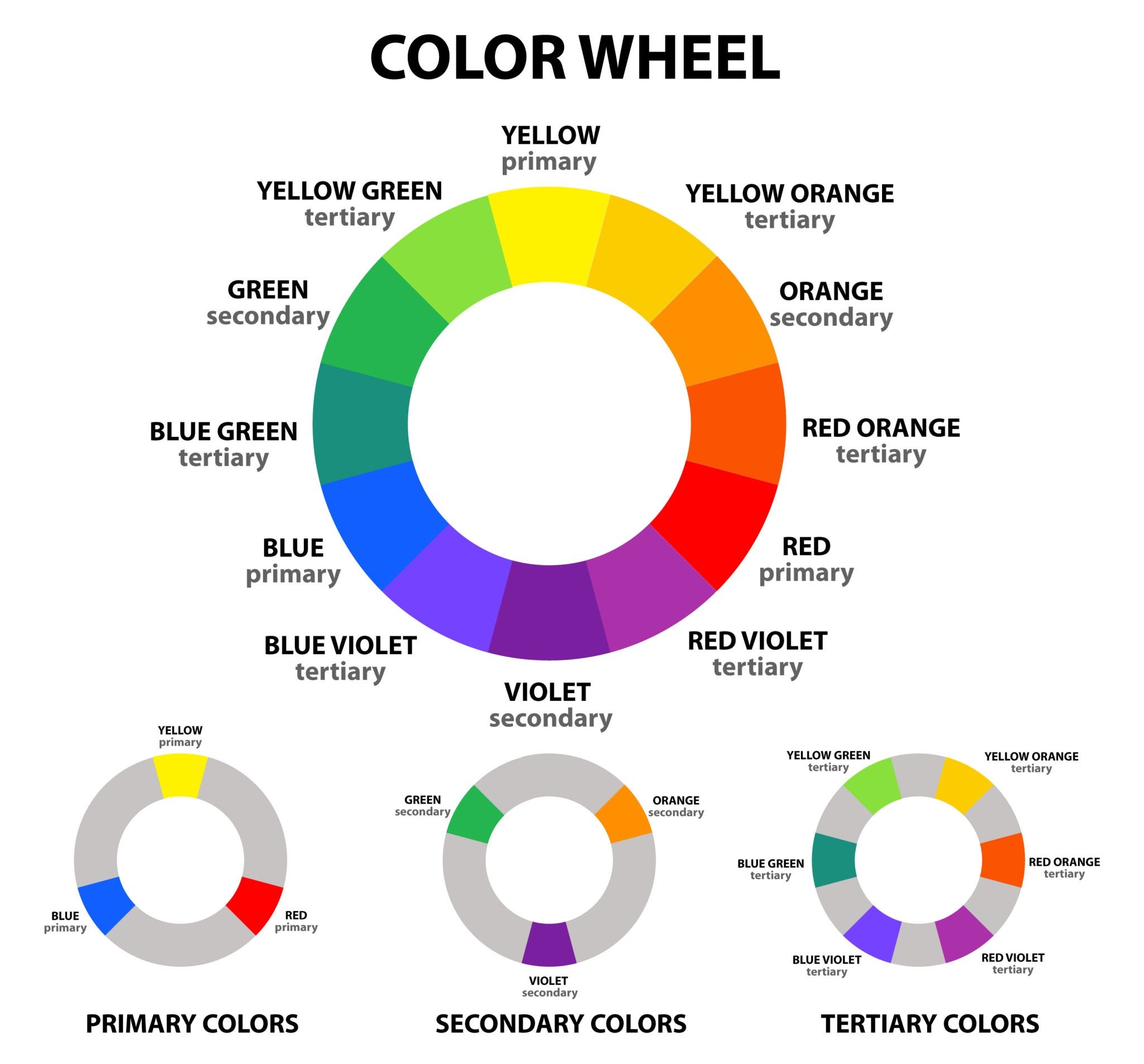
1. Foundations: How do we actually see and perceive colors?
Before we get into psychology, we need to understand the technical side of design. There are two basic systems that every business owner needs to understand in order to avoid costly mistakes in print or digital output.
RGB vs. CMYK
RGB (Red, Green, Blue): Used for everything displayed on screens. Colors are created by mixing light.
CMYK (Cyan, Magenta, Yellow, Key/Black): Used for print. Colors are created by mixing pigments.
A common mistake is designing a visual identity exclusively in the RGB system, only to later discover that those bright shades look washed out and gray on paper. That is why it is crucial to work with professionals who understand these differences. It is part of the broader story of why cheap design is the most expensive option, because fixing printing errors costs far more than the initial investment in a good file.
Theory of contrast and readability
Color directly affects how usable your website is. If you use light gray letters on a white background, it may look "minimalist," but 40% of your visitors will give up because they cannot read the text without straining their eyes. Accessibility standards (WCAG) define clear contrast ratios that every serious designer must follow.
2. The emotional vocabulary of colors
Every color activates specific neural pathways in our brain. Here is a detailed analysis of the most important colors in graphic design and marketing strategies.
Red: Energy, urgency, and passion
Red is the color with the longest wavelength, which means our eye notices it fastest. It raises blood pressure and speeds up breathing.
When to use it: For Call-to-Action (CTA) buttons like "Buy Now", for food brands (McDonald's, Coca-Cola) because it stimulates appetite, or for industries where speed is key.
Risk: Too much red can cause aggression or a sense of danger.
Blue: Trust, stability, and logic
The most popular color in the corporate world. Blue is associated with the sky and the sea, elements that have been here for millions of years, so the brain perceives it as something constant and reliable.
When to use it: Financial institutions, IT companies, healthcare. It calms the user and suggests professionalism.
Risk: It can feel cold and unapproachable if not combined with warmer details.
Green: Nature, growth, and wealth
Green is the easiest color for the human eye. It signals safety in nature; where there is green, there is water and food.
When to use it: Eco-friendly products, organic cosmetics, but also banking (the color of money).
Risk: Certain yellow-green shades can suggest illness or toxicity.
Black and white: Luxury and purity
Black is not a color, but the absence of light, yet in design it carries the weight of authority and elegance. White is space, freedom, and a new beginning.
When to use them: Luxury brands (Apple, Nike) use this contrast to achieve a timeless look.
Risk: Too much black can be depressing, while too much white can make it seem like the website is unfinished.
Well-combined colors can help when building a strong brand and visual identity.
3. Palette creation strategy: The 60-30-10 rule
How do you combine all these emotions into one cohesive brand? There is a golden rule I use when creating every visual identity.
Color role | Percentage | Purpose |
Primary | 60% | Dominant color that sets the tone (usually neutral). |
Secondary | 30% | Color that supports the primary and adds visual interest. |
Accent | 10% | Color that "stands out" and is used for the most important actions (buttons, links). |
This rule ensures that the user is not overwhelmed with information. When someone enters your website, they subconsciously look for signposts. If all your elements are in bright colors, nothing is important. If everything is neutral and only one button is in the "accent" color, you have told the user exactly what they need to do without a single written word.
4. Cultural filters: Does your color "translate" well?
Color is universal, but its meaning is not. If you plan to expand your business beyond the Balkans, this is a crucial chapter.
White: In the West, it is a symbol of purity; in China, it is the color of mourning.
Yellow: In Egypt, it is the color of mourning (the color of gold that goes into the afterlife), while in Japan it is a symbol of courage.
Purple: Traditionally the color of nobility in Europe because the pigment was the most expensive, while in some Latin American countries it is associated with death.
When planning a design, we always return to market research. A design that works in Berlin may not have the same effect in Tokyo. That is the level of detail that separates average design from the kind that brings millions of views and impressions.
5. Color psychology and user experience (UX)
Colors are not there just to make the logo look nice. They are there to solve user problems. In 2026, the focus is shifting toward personalized experiences. Properly chosen colors are a key element of a professional logo.
Dark Mode: More than a trend
More and more users prefer dark mode. That changes the way we experience color psychology. Colors that seemed warm on a white background can look aggressive on black. When creating a modern website, the designer must anticipate both scenarios.
Color as navigation
Through color, you can group information. For example, if you sell different product categories, assigning a specific color to each category helps the user find their way faster. The brain remembers color faster than the text "Cosmetics" or "Electronics".
In my article on design trends for 2026, I mentioned tactile digitalism. Color here plays the role of shadow and light, giving digital objects weight and realism, which further strengthens the user's emotional connection with the brand.
6. How do you test your color palette?
Never rely on assumptions. There are objective ways to check whether your color choice works:
A/B Testing: Create two versions of a landing page with different CTA button colors. The results will often surprise you.
Squint Test: Look at your design with half-closed eyes. If you cannot clearly see where the most important information is, the palette is not good.
Competitor analysis: You do not want to look identical to your biggest competitor. If everyone in your industry is blue, maybe it is time to be purple and take the position of an innovator.
Color is your investment
Choosing colors is a strategic decision. It affects how long people stay on your website, how much they trust you, and, ultimately, how much money they leave with you. Quality graphic design uses psychology as a tool to achieve your business goals.
The next time you think about changing your visual identity, do not ask, "which color do I like", but rather "how do I want my clients to feel".
If you are not sure whether your current design is sending the right message, feel free to look at my previous work or contact me directly through the contact page for a free consultation about your branding.