
Stop & Go: logo design for vending machines
Logo and branding for a vending machine store
About the project
Stop & Go is an automated retail brand focused on healthy, accessible nutrition through modernly designed vending machines. The goal of the project was to build a visual identity that combines dynamics, trust, and accessibility, through a minimalist and functional design approach.
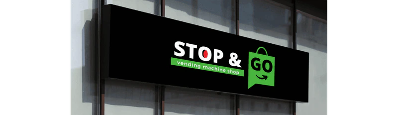
Logo and visual identity
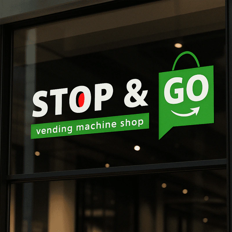
Logo STOP & GO combines contrasting concepts: "STOP" as a moment of pause and "GO" as a call to action. The design communicates the idea of speed, accessibility, and smart shopping. The word "STOP" is in the base color with a distinctive red accent in the letter O, which visually imitates a stop button or a warning. "GO" is positioned within a recognizable green bag shape with a smile - symbolizing shopping and movement.
Color palette
The colors used in this project were not just an aesthetic choice, but carriers of meaning:
- Black (#000000) - symbolizes stability, seriousness, and clarity in brand presentation. Used for contrast and to highlight elements.
- White (#FFFFFF) - provides cleanliness, clarity, and allows other colors to stand out.
- Green (#49b640) - the primary color of the brand. It associates with nature, freshness, and healthy eating. Used to highlight key brand elements.
- Red (#ed1b24) - used accentually, to attract attention (e.g. red dot in the logo). It brings energy and recognition.
Access to design
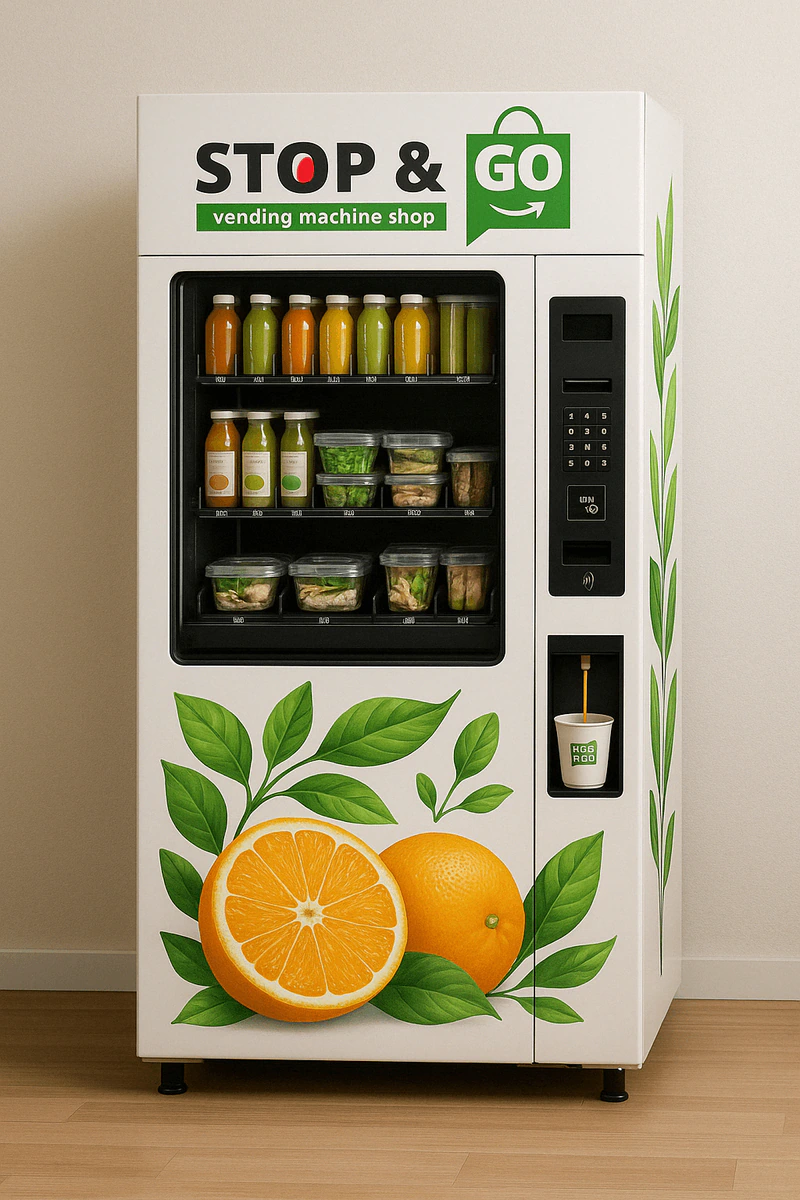
The entire visual system was created with a focus on readability, simplicity, and memorability. The visuals are adapted for both physical applications (packaging, signage, branded vending machines) and digital formats (social media, promotional visuals, mockup presentations).
In collaboration with the technical implementation team, user interfaces were designed for the screens of the vending machines themselves. The focus was on simple user experience, with large icons, clearly highlighted steps, and visual representations of the products. In addition, the interface includes options for ordering freshly squeezed juice, with real-time juicing animation.
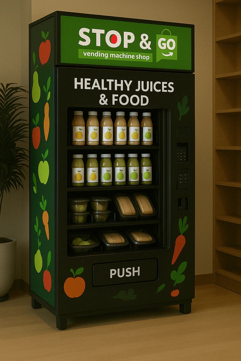
Promotional materials
As part of the project, numerous promotional materials have been created - juice bottles, paper cups, fabric bags, business cards, stickers for vending machines and windows. Each element is designed to maintain the consistency of the brand's visual language, with illustrations of fruits and vegetables that further emphasize the naturalness of the products.
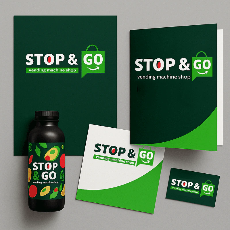
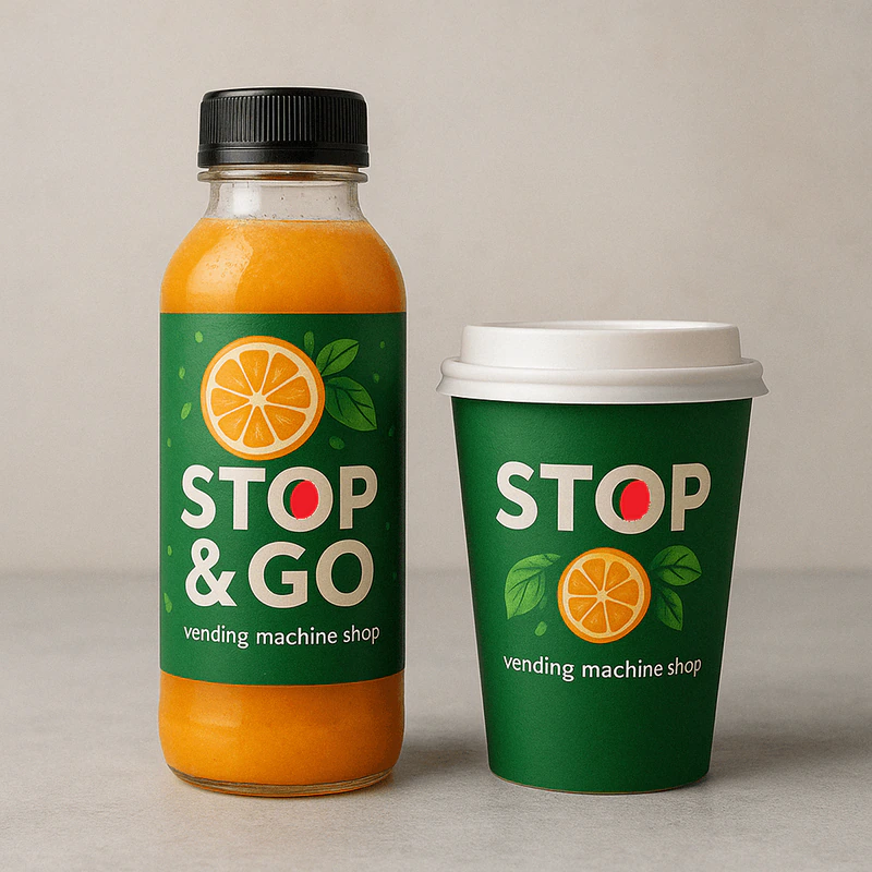
STOP & GO is an example of how a strategic visual identity can strengthen a brand positioned in a rapidly growing market. Through strong symbolism, a carefully selected palette, and the application of design on various materials, a brand has been created that clearly communicates - healthy, fast, reliable.