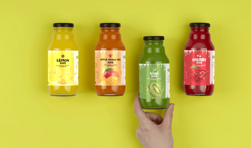
Fresh Juice labels: a blend of taste and visual identity
Label design
About the project
In a world where visual identity decides whether someone will reach for a product on the shelf, the label becomes much more than decoration: it is a quiet story of quality, nature, and brand values. Through this project focused on bottle labels for cold-pressed juices, my goal was to combine clean aesthetics with functionality, emphasizing the naturalness, freshness, and transparency of each beverage. Using fruit illustrations, modern typography, and carefully selected colors, each label communicates the uniqueness of the flavor while also ensuring the clarity of information for the end user.
Design process
The design of labels for bottled fruit juices is more than an aesthetic task - it is a carefully thought-out process that combines brand strategy, visual communication, and functional design. It all starts with understanding the product and the target group: what the juice tastes like, what its nutritional values are, who it is aimed at, and what values the brand wants to communicate.
After market and competitor research, the conceptualization phase follows, where visual ideas are developed that reflect the naturalness, freshness, and quality of the product. This may include illustrations of fruits, organic colors, modern typographic approaches, and clearly structured information.
Colors
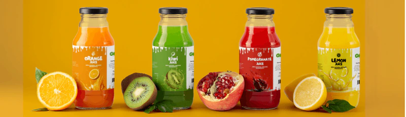
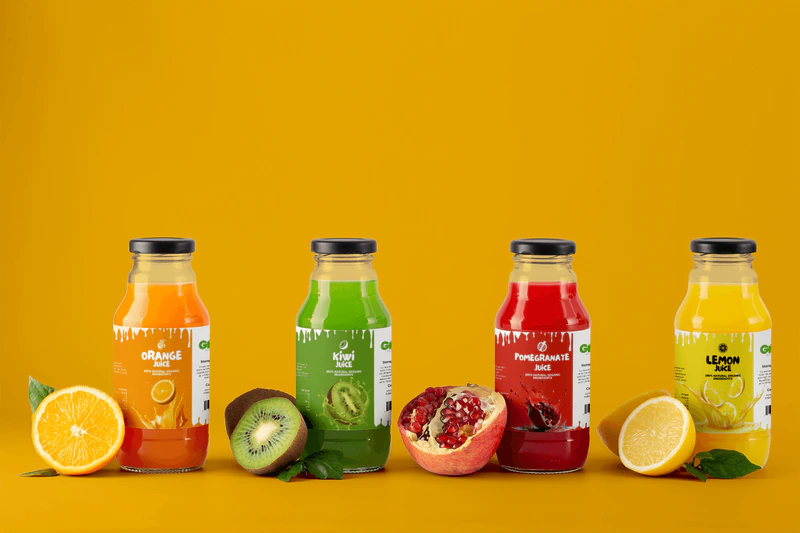
The colors on the labels have been carefully chosen to visually communicate with the main ingredient of each juice, namely the type of fruit from which the drink is made. This strategy contributes to the quick recognition of products on the shelves and creates a strong association between taste and visual identity.
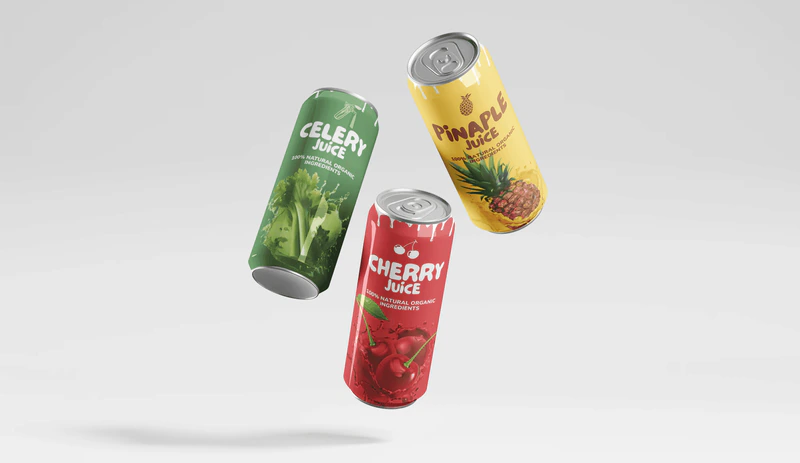
For example, for orange juice, a vibrant orange color was used that reflects the freshness and energy of citrus, while for cherry juice, dark red and burgundy shades were applied that evoke the rich flavor and natural sweetness of the fruit. Green tones represent apple or kiwi, bringing a sense of naturalness, health, and freshness. Golden-yellow shades accompany pineapple juices, while red and pink shades perfectly illustrate pomegranate and strawberry.
By using colors that reflect the natural characteristics of the fruit, consistency in the visual identity of the brand has been achieved, as well as an emotional connection with the consumer, since color not only refreshes the eye but also suggests the flavor that follows.
Typography
In the design of labels for bottled juices, two carefully selected fonts have been used to create a balance between character and readability.
Le Petit Cochon is used for the brand name and type of juice, as its hand-drawn style adds a touch of warmth, emphasizing artisanal production, natural ingredients, and a caring product creation process. Its decorative character highlights the naturalness of the product and creates an emotional connection with the consumer at first glance of the label.
For all other textual elements, such as descriptions on how to consume the juice, composition, nutritional values, and other informative sections, Nunito - a modern sans-serif font known for its readability and neutral tone - has been used. It ensures clear and concise information delivery without compromising visual cohesion.
The combination of these two fonts achieves a visual balance - Le Petit Cochon brings character and recognizability, while Nunito ensures functionality and ease of reading.
Labels
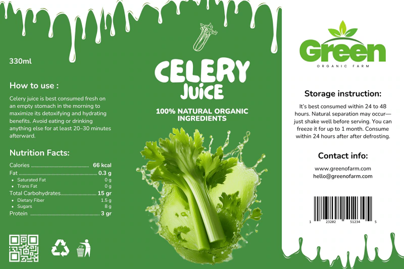
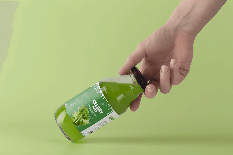
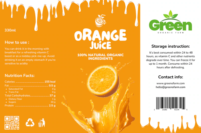
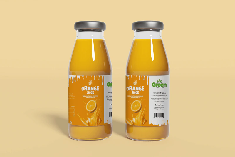
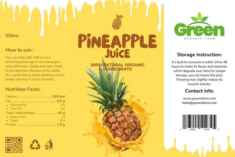
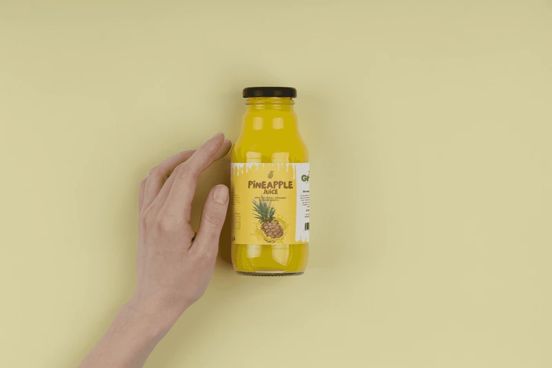
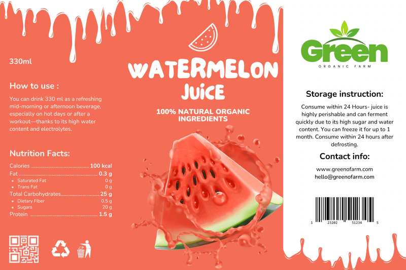
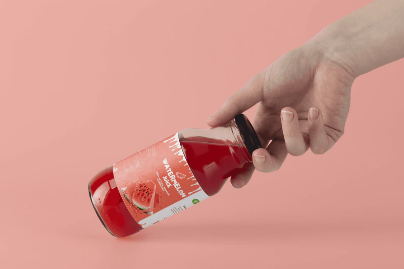
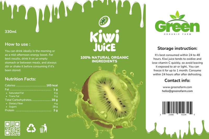
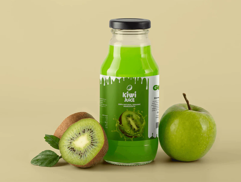
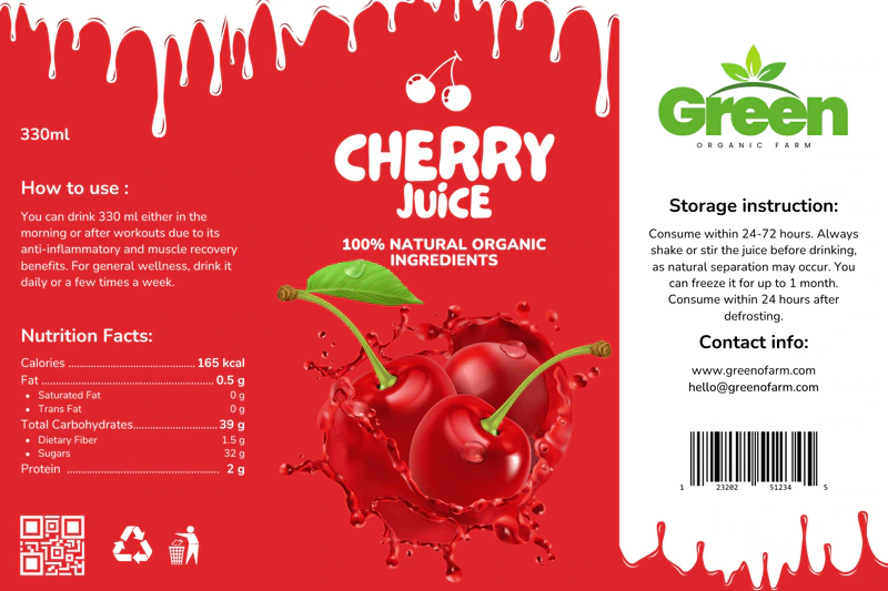
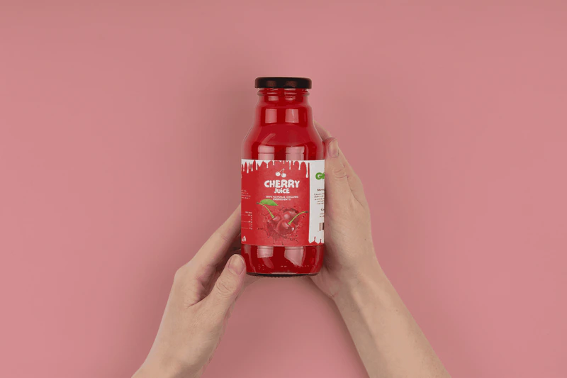
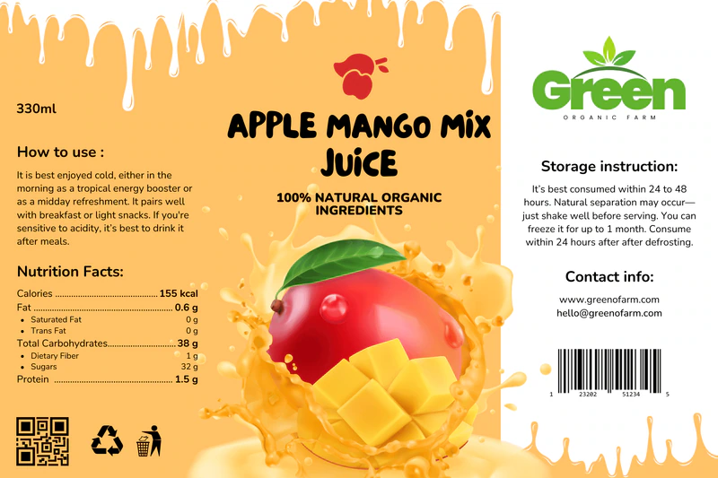
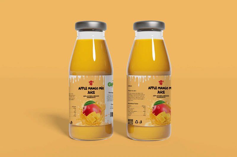
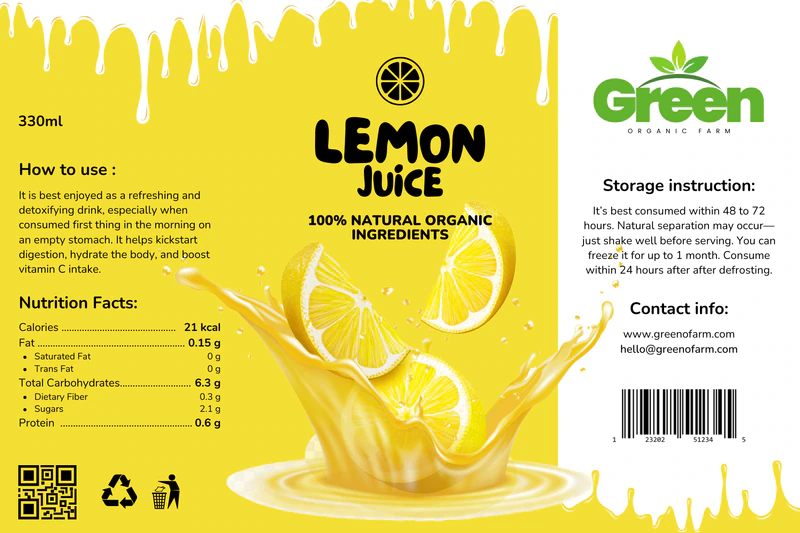
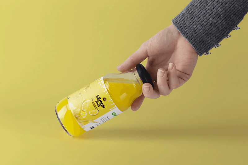
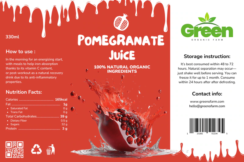
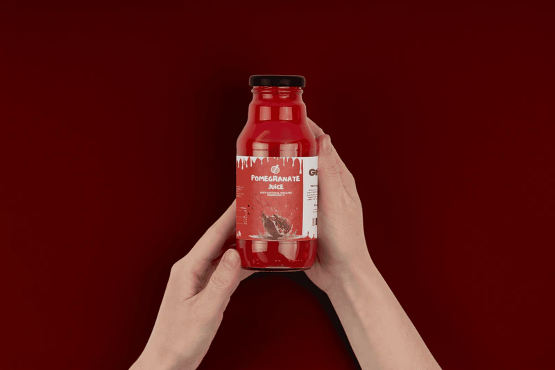
The label design for shipped juices represents a blend of aesthetics, functionality, and strategic thinking. Through carefully selected typography, a color palette inspired by natural ingredients, and a clearly defined visual style, a label has been achieved that not only grabs attention but also clearly communicates the product's values - naturalness, freshness, and quality.
By combining the expressive font Le Petit Cochon to highlight the brand and type of juice with the readable and modern font Nunito for conveying key information, a label has been created that successfully balances character and functionality. This project demonstrates the powerful impact design can have when it is carefully conceived, aligned with the product, and tailored to the end user.