
A year later, I am going through the 2025 graphic design trends, and for each one, I'm sharing whether it stayed, became a standard, or faded away.
I first published this text in August 2025 as an overview of trends for that year. Now, in the fall of 2026, I return to it with a different question: what of all that has actually remained in use, what has become so common that no one calls it a trend anymore, and what has passed.
The ratings below are my observations from everyday work with clients, not the result of research. If you are interested in what is current now, read the article current trends in graphic design for 2026.
Five main trends from 2025 and what happened to them
1. Minimalism with expressive details: stayed
In 2025, minimalism took on a new dimension: clean lines, plenty of empty space, and light tones in contrast with a single strong accent, usually a neon color or a 3D element. The reason was practical. Such design directs attention to what is important and is easy to use on a screen.
The foundation remained and is still the most common starting point today. The accent has changed: neon and glossy 3D shapes have given way to textures and warmer details, so now we talk about neominimalism.
2. Personalization with AI tools: became standard
In 2025, tools for generating visuals promised faster prototypes and solutions tailored to each client. The first part came true. AI is now part of the regular workflow: it is used for sketches, variations, and preparing materials.
The second part came true less than expected. A personalized visual for each user is still a rarity for small businesses. Instead, a new problem emerged: many visuals that look alike. That is also the reason why in 2026, hand-crafted design is highly valued.
3. Accessibility in UX design: became standard
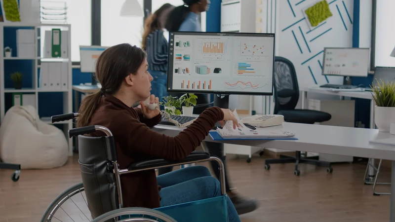
In 2025, accessibility and the WCAG standard were talked about as a trend. This referred to clear fonts, sufficient contrast, adaptation to different devices, and voice navigation.
Today, this is no longer a matter of choice or fashion. Readable text, contrast, and responsive display are an obligatory part of any serious project. Voice navigation is the only part of that list that I almost never encounter on ordinary websites.
4. Micro-animations and interactive UI elements: became standard
Micro-animations are small movements with which an element responds to a user's action: a button that reacts to a click, a field that confirms a correct entry. A year ago, they were a way for a website to stand out.
Today, users expect them, and tools like Framer offer them without additional programming. That is why they are noticed less when they exist, and more when they are absent. In the meantime, movement has also expanded to typography, which is one of the trends for 2026.
5. Authenticity and sustainability in branding: partially stayed
In 2025, brands emphasized authenticity and ecological responsibility through logos inspired by nature, sustainable packaging materials, and more open communication of values.
Authenticity has remained and become even more important, only today it is expressed differently: through hand drawings and intentional imperfection. Sustainability as a visual style has weakened. A green leaf in a logo no longer convinces anyone if there is no real practice behind it, so I advise clients to show it with concrete product data, not symbols.
Other directions from 2025
Typography as the main element: stayed
Large, bold headlines combined with subtle details were one of the recognizable signs of 2025. That direction has remained and developed. Typography is still the bearer of identity, and what is new is that it increasingly moves and changes shape.
Colors inspired by nature and technology: half-and-half
The 2025 palette merged earthy tones, green, and blue with futuristic neon shades. Earthy and natural tones remained and moved toward even calmer, lighter shades. I see neon accents much less often today, mostly with technology and music brands.
Generative design: faded as a style
It was expected that visuals created using algorithms and machine learning would become a recognizable style. That did not happen. Generative tools have remained in use, but as part of a process that is not visible in the finished design. A visual that looks like it was made by an algorithm is more of a drawback than an advantage today.
3D and AR integration: 3D stayed, AR faded
Elements in 3D technique have remained, especially in illustration and with brand mascots. Augmented reality (AR) did not catch on with smaller companies as heralded. It requires a budget and maintenance, and rarely solves a real problem for small businesses. It remained where it has a clear purpose, for example when a customer wants to see a product in their space.
Brand story through visual identity: stayed
Brands used visual identity to tell a story and build an emotional connection with the audience. This was never a passing trend, but the foundation of good branding. Images, colors, and graphics that consistently say the same thing work just as well today.
Brief overview: what stayed and what passed
- Became standard: accessibility, micro-animations, AI tools in daily work.
- Stayed in an altered form: minimalism, typography as the main element, authenticity, natural colors, 3D elements.
- Faded: neon accents, AR in small companies, generative design as a separate style, sustainability reduced to symbols.
The pattern is clear. What remains is what makes it easier for the user to use or gives the brand a clearer voice. What has passed is what was primarily supposed to look modern.
Why some trends stayed and others did not
When I compare what remained with what passed, I see three recurring reasons:
- The trend solved a real problem. Accessibility and micro-animations help the user read text and understand what happened after a click, so they had no reason to disappear.
- The trend was cheap to implement and maintain. A single accent color or a large headline does not require a special budget, while an AR experience requires development, testing, and constant maintenance.
- The trend did not depend on a single tool or effect. A style recognized by the tool it was made with becomes outdated as soon as everyone starts using that tool.
It is worth asking the same three questions for every new trend before you invest money in it.
What this means for your brand today
If your identity or website was done in 2025, you probably do not need to change it. Check the basics: is the text readable, is there enough contrast, and is the identity consistently applied in all places. If that is fine, it is enough to refresh the details that age the fastest, such as neon accents, illustrations, or glossy 3D shapes.
From this review, I also draw a lesson for future trends: invest in the logo and basic colors for the long term, and play with trends in campaigns and posts, where changes are cheap. If you need help with that, see how I do brand visual identity.
How this looks on a real project is shown by the label design for Fresh Juice.
If you want us to check what of this is worth refreshing on your brand, get in touch.