
A landing page has one job: to guide the visitor to take a single action. Here is how to create it, from the target audience and structure to the copy, pricing, and measurement.
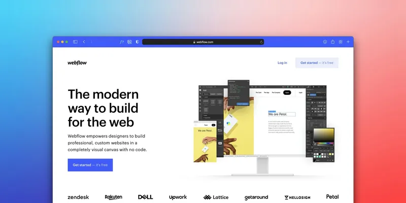
A landing page is not the same as a website's homepage. The homepage covers your entire business: all services, all information, all paths forward. A landing page has one job, to guide the visitor to take one specific action: to order, send an inquiry, sign up, or download a document.
That is why pages for paid campaigns look different from the rest of the website. They have no menu, no link to a blog, no "check out our other services" section. Everything that distracts from that single action is intentionally removed. In this guide, I will go through step-by-step what I do when creating such a page: who it is written for, what order the sections should follow, how to write the text, what to do with the price, and how to measure if the page is working.
Who you are writing for and where that person is coming from
This step is most often skipped, yet everything else depends on it. Before you write a single word or place a single image, you must know who is coming to the page and from where. The text directly depends on that.
Someone coming from a Google ad for "web design for hair salons" already knows what they are looking for. They do not need an explanation of what web design is. They need a reason why it should be you, why now, and how much it costs.
Someone who sees you for the first time in an Instagram story does not have that context. They need more of an introduction: who you are, what problem you solve, and why it should matter to them at all.
The same page for both cases will not be good for either. Therefore, before you start, write down three things:
- One specific person you are writing to: what they do, what bothers them, and what they have already tried.
- The traffic source: search, social media ad, newsletter, or recommendation.
- One specific action you are asking from that person.
If you have three services or three different groups of customers, make three pages. A single page trying to sell everything sells nothing properly.
Landing page structure, section by section
Successful landing pages resemble one another, and that is not a lack of imagination. Visitors have habits and expect answers in a specific order: what is this, is it for me, why should I trust you, how much does it cost, what's next. When you respect this order, the page is read effortlessly. These are the parts I put on almost every page.
Hero section: the first few seconds
The hero section is what a visitor sees before they start scrolling. That is where they decide whether to stay. It must contain three things:
- What you offer, concretely and without metaphors. "Web website for your small business" is clear. "Digital solutions for your success" means nothing.
- Who it is for. "For entrepreneurs just starting out" is targeted. "For everyone who wants progress" is for no one.
- Why you: your biggest advantage in a single sentence.
Along with this goes a visible call to action (CTA) button that states what happens after clicking. "Send inquiry" is clear. "Learn more" says nothing.
The photo or illustration in the hero section should support the message, not replace it. If the image says nothing about who you are and what you do, replace it or remove it.
The problem you solve
After the hero section, before you start talking about yourself, show that you understand the situation the visitor is in. Write concretely, in their own words:
- "You have a website, but no one is sending inquiries."
- "You have Instagram, but you do not know how to turn followers into customers."
- "You pay for ads, and visitors leave as soon as they arrive."
When someone recognizes their situation, they keep reading because they know the page was written for them. Two to three such sentences are enough.
The solution: what the client gets
Only now should you talk about your offer. The most common mistake here is describing the process instead of the results. The client does not care how many steps your workflow has, they care about what they will have at the end.
Instead of "I go through phases of research, sketches, design, and testing," write "You get a landing page ready for the campaign, with copy, design, and a form that is proven to work." The first sentence describes your job. The second describes what the client gets.
A short list of benefits is fine, but do not turn the entire section into a bulleted list. Two connected sentences explain the benefit better than six bullet points of three words each.
Proof that you can be trusted
A visitor who does not know you has no reason to trust you just because you have described yourself nicely. Proof comes in three forms:
- Client testimonials. Those that describe a specific problem and a concrete outcome are worth the most, rather than generic praise like "Great cooperation, highly recommend." Ask the client to write what it was like before, and what it was like after.
- Work samples. If you sell design, show the design. If you sell results, show the results.
- Numbers, but only those you actually have and can back up: how many projects you have completed, how many years you have been working, how many regular clients you have. A fabricated or inflated number does more harm than good.
If you are at the beginning and have none of this, do one project for free or at a lower price and ask for an honest testimonial. One real recommendation is better than an empty section.
Price or estimated price
Many advise not to publish the price and to wait for a conversation with the client. My experience is different.
When there is no pricing information on the page, people with limited budgets leave without even reaching out, and people with realistic budgets often leave because they do not know if they can afford the service and do not want to schedule a call just to find out.
You do not have to publish a fixed price list. An estimate is enough ("projects of this type range from X to Y euros, depending on the scope") or an explanation of what the price depends on. An open stance on pricing builds trust faster than hiding it.
Final call to action
At the end of the page, it must be clear again what you are asking for. A visitor who has read everything and is ready to get in touch should not have to scroll back up to find the button.
The final CTA can be slightly warmer than the first. While in the hero section it is direct ("Send inquiry"), at the bottom it can read "Let's talk about your project" or "Schedule a free call." The action is the same, only the tone changes.
Make sure the form asks only for what you need for the first step. Name and email are usually enough, and you can ask everything else in your reply.
Copy that sells without sounding like an ad
A visitor immediately senses whether the page talks about them or about you. "A team of experts with years of experience applying the latest methods" talks about you. "You get a website built to bring in clients, not just to exist on the internet" talks about the client.
The check is simple: count how many times "we" and "our" appear on the page, versus "you" and "your". If the first group leads, the text needs to be rewritten.
A landing page is not read like a professional article. The visitor skims through and stops where something catches their eye. That is why I stick to a few rules:
- Headings must make sense even when read on their own, without the text below.
- The first sentence of each paragraph says what the paragraph is about.
- Sentences and paragraphs are short, one thought per paragraph.
- Concrete words instead of abstract ones. "Response to inquiry within one business day" means something. "Fast and reliable service" means nothing.
- Words the customer uses, not technical terms from your industry.
Design that does not distract
Good landing pages often look simple. That simplicity is the result of many decisions about what to leave out, and it is harder to achieve than a cluttered page.
- One color for actions. All CTA buttons are the same color, and that color is not used for anything else. The visitor quickly learns where to look when they are ready.
- Whitespace has a function. The space between elements separates sections and makes reading easier. A page cluttered with content looks cheap and is tiring.
- Readable typography. A font that is interesting but hard to read works against you. Use large enough letters, good contrast, and lines that are not too long.
- Mobile-first. If traffic comes from social media, visitors are mostly on their phones. Design the page for small screens first, then expand it for desktop.
For every element you add, ask yourself if it helps the visitor make a decision. If it doesn't help, you probably don't need it.
Technical details that must not be skipped
Good copy and design are not worth much if the page has a technical problem.
- Loading speed. Optimize images before uploading them and avoid videos that autoplay in the background. Test the page using the Google PageSpeed Insights tool, specifically the mobile result.
- HTTPS. A browser showing a warning that the page is not secure will drive the visitor away before the first sentence.
- Metadata. The title and description visible in Google results are the first contact with the page. If they are empty or automatically generated, you are missing an opportunity to earn a click.
- A working form. Send a test message yourself and check if it arrived in your inbox, not spam. Also, check what the visitor sees after submitting.
- Measurement. Set up analytics and conversion tracking before launching your first ad, otherwise you won't know what is working.
Most common mistakes
When I review clients' pages before starting cooperation, the same things recur: too many different calls to action, a headline that could fit on any website, no proof, and a mobile version done as an afterthought. I have covered each of them, with symptoms and how to check them, in the article why landing pages fail to convert visitors into customers.
How to know if the page is working
Everything up to now is an assumption until you look at the data. These are the four things I track:
- Conversion rate: the percentage of visitors who did what you asked. There is no single number that applies to everyone, as it depends on the industry, price, and traffic source. Compare the page to its past results, not to other people's averages.
- Time on page and scroll depth: they show whether people are reading and how far they get. If most leave before seeing the offer, the problem is at the top of the page.
- Bounce rate: the percentage of visitors who leave without taking any action. A high rate with a very short stay means the hero section is not doing its job.
- Traffic source: the same data split by channel. If you pay for ads and conversion is low, the cause may be a disconnect between the message in the ad and the message on the page.
Google Analytics and Search Console are free and quick to set up, so there is no reason not to have insight into how the page behaves. Let the page run long enough to gather data, then change things one by one: the headline, then the CTA, then the order of sections.
What's next
A good landing page does not have many elements. The hard part is that every element must be in the right place, for a clear reason, and written for one specific person.
A practical example is the web design of the website for SimpleCRM.
If you already have a page that does not bring results and you don't know where the problem is, I handle that as part of a UX audit: I go through every part of the page, explain why it's not working, and give concrete recommendations on what to change. If you need someone to build the page from scratch in Framer, I do that too.